Friday, July 31, 2009

CASA MARGARITA - PART TWO

This was the master bedroom. My closet, the size of a small room, was tickle-me-pink. My ex's closet was rubber duckie, the same color as the walls in my workroom on the third floor.
Bidets are great for washing your feet. This bathroom, once a bedroom, was huge, but the space was all in middle where nothing could be done. The house originally had 4 full bathrooms and we added this one because everyone needs 5 full baths!
The color in the bathroom was lilac. I wanted the bedroom to be lilac and the bath the aqua that's in the master. My ex wanted the bath to be lilac because the apartment we lived in before this house had a lilac kitchen with white fixtures and he just really liked the way it looked. Since I liked both colors in both rooms, I agreed. To this day, though, I would love to have a lilac bedroom.
Again, bathrooms (normal size, that is) are hard to take pictures of. This bathroom is on the second floor and has the original hex tile floor. We found a bathtub that was from 1913 in a salvage place. The house was built in 1920 (I think) so the tub fit right in.
My ex workroom. The floor was screaming green and the walls rubber duckie. The bathroom, which you can't see, was cerise. The colors on the third floor were much more intense. After a while, even the brightness of the colors seemed to fade and I remember thinking, "We need to repaint and punch up the colors." Yeah, right! This work space was about 24' x 12'. My cutting/work table was 12' x 6' x 43 1/2" high, the perfect height for me. We built the table in the room so there was no getting it out when I left.
The laundry room with under-the-counter washer and dryer. I also had another laundry room in the basement with large capacity appliances, so I could wash and dry fabric.
Exercise room.
The view out the master bedroom window. We had a fairly large yard for a city house. Of course, putting a three car garage took up a lot of that space, but with a house as large as this one was, a single car garage was silly. The house was approximately 6000 square feet. We paid $230,500 for it and then did the gut rehab, which took a year and a half and cost another $100,000 or so. Can you imagine what this house would cost in California?

Thursday, July 30, 2009

CASA MARGARITA - PART ONE


This is the outside of my ex-house in Chicago. It is in Rogers Park, which is as far north as you can go and still be in the city of Chicago. It was named Casa Margarita because of the color. In some light it looks more green; others, like this shot, it appears yellow.
The front, enclosed porch. It was only place in the house I could use the Mexican tile and not have it look ridiculous. This is a prairie-style house and Mexican tile is definitely not in keeping with the style.

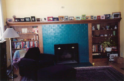
This was the library/living room. The fireplace was some hideous color, so we painted it teal. What you can't see is the entire wall of bookcases and the original pocket doors.


This is the bathroom on the first floor, with the original green and white tile. This shade of pink was truly the only color that looked good with the tile. Then I found a fabric for the shower curtain that allowed me to have more than just pink and green in the room. The shot is a bit blurry. It was a very hard space to take a picture of.


The family room, with the area to the left and the kitchen to the right.
Can you find all 5 cats?


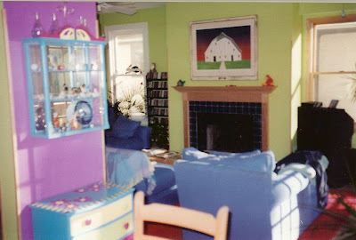
The fireplace in the family/dining/kitchen area. The flash is making the walls look less green than they really are. See above picture for the green color.
My dream kitchen, even though I don't like to cook.


Another view.
An old chest and curio cabinet I painted.
Close-up of chest top. I painted this all by hand, with no taping to make sure the lines were straight. I think I did a pretty good job, especially since I can't really paint or draw.

As I said before, when you live in Chicago and the sun tends not to shine very often and winter lasts about 8 months (or so it seems) you have to do something to brighten things up. My way was to paint every room a different tropical color. All of these were crayola colors. These pictures are of the first floor, though I left off a couple of rooms. The house had 3 floors plus a full basement that was also painted using the leftover paint from the rest of the house.
Tomorrow, I'll post the second and third floors.

Wednesday, July 29, 2009

GRAZELDA

Okay, here is my car, Grazelda Golf. She is one of the rarest Volkswagens ever made. She is a '96 and there are only 70 of her version. They made a total of 280, 4 different versions. As you can imagine, I get all kinds of comments about her. As far as I know, I have the only one in San Diego, which is both good and bad. Good because who would steal her? It's not like she blends in. And bad because everyone always knows where I am. I can't sneak anywhere.

So tomorrow I'll do the post with my ex-house pictures.

Tuesday, July 28, 2009

COLORFUL LIFEGUARD HUTS

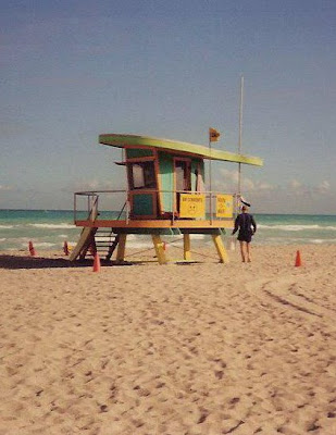
Colorful! And creative! They are all different shapes and sizes. All these huts are on Miami Beach. I took these pictures in 2000, but I'm sure they are still as pretty. At least I hope some city official didn't get it in his head that basic, boring, all the same color and design was better.


In case you didn't already know this about me, I LOVE color. There used to be an ad for a paint company (I think) and the tag line was, "Life is too short for beige." I couldn't agree more.

Next post, pictures of my ex-house, which was painted in all tropical colors! Hey, when you live in Chicago and it's gray more than sunny, you gotta do something to keep from going mad.

Monday, July 27, 2009

YIPPEE!!! A BBF AWARD

Julie Marie at Idyllhours created this award and her very first recipient was Karyn from French Charming. BBF stands for Blogger Favorite Friend or I think it can also stand for Blogger Favorite Find. The rules for this award are similar to all those other blog awards floating around:

Copy the award and post it on your blog.
Link it back to the person you received it from.
List 10 things you love about blogging.
Pass it along to 10 other blog pals.

What I love about blogging:
(It's hard to not just copy Karyn's list and claim it as my own.)

1. I love that I now 'talk' to people all around the world.
2. I love all the new friends I've made locally.
3. I love the support that bloggers show each other.
4. I love the inspiration that each and every one of you brings to my life.
5. I love sharing my work.
6. I love that posting can be serious or it can be silly - anything goes!
7. I love that I look forward to turning my computer on each morning so that I can catch up with all the blogs I love.
8. As Karyn said, I love that people read my blog.
9. I love how willing everyone is to share ideas.
10. I love knowing that the possibilities are endless with blogging.


Thank you, Karyn.
You have been, and continue to be, an inspiration in my life. I look forward to your next 100 posts!

I pass this award to the following blogs:


I also want to thank everyone who commented on my last post. It means a lot that you took the time to wish me well. I am happy to report that, although I am still rather sore, my back to definitely better. I've been resting it and using my next door neighbor's jacuzzi on a regular basis. I do believe another massage is in order, as well.

Thursday, July 23, 2009

I LOVE SANDALS AND FLIP FLOPS


I was going to do this post on Friday morning but I hurt my back and I can't sleep. I may have a broken rib or it is somehow out of place and your guess is as good as mine as to how this happened. All I know is I am in major PAIN. So to entertain myself, I took pictures of all my sandals. I couldn't take the pictures with my feet on the floor because I tan the color of my hardwood floors and it was hard to tell my legs from the floor. Weird, I know, but then again, so is this post!

Leather reefs
Havaianas with the Brazilian flag, a gift from my Brazilian exchange student
Leather tevas
Not quite a flip flop
Leather rose in green
and in blue
This picture had to be rotated so you could see what these sandals are. These are my favorite because they are so unusual.
These remind me of fireworks.
Boring, basic Rainbow flip flops.
Fuschia BCBG fancy sandals.
Beaded
and bejeweled
These are shell and bead and the only sandals I have with straps.
These my mother made for me. They kind of look like slippers and feel that way too!
These are the basic black reefs that I wear every day, which explains why
my feet look like this with no flip flops on.

Wednesday, July 22, 2009

SUNBRELLA SLIPCOVERS AND A GREAT VIEW

This sofa is one of the hardest I've ever done. It doesn't look like it, but looks can be deceiving. What made it so hard was the shape of the back cushions, which you can't even see in this picture. Normally, the box on a cushion is the same width all the way around. Not these. The bottom is more like a bolster/wedge and so is much wider. I, thank goodness, took one of the cushions with me because I knew I was going to have trouble. Having it didn't make it any easier, but without it, the covers would never have fit properly. Even the side cushions are a strange shape. You can kind of tell from the picture that they sort of bend.
The back view. My client didn't want a skirt at all. Her real reason for wanting slipcovers is to protect her Roche Bobois furniture from her 10 month old daughter and her nearly 3 year old son. She chose Sunbrella for obvious reasons.
A closer up of the front. Ths sofa slipcover was delivered yesterday, as planned. When I was there installing the covers, a big problem presented itself. In my last post I said what a pain it is to re-do someone's work. Well, it's not a lot better having to re-do your own either.
The chair slipcovers would not go on. I didn't realize they needed zippers. Not the worst thing, but a real hassle. I had to come home yesterday and cut open the back side seam on each slipcover and then, because there is welting on the bottom edge, I had to cut through the welting, too. Putting the zippers in wasn't too bad and I kept wondering why it is I hate zippers in slipcovers until it occurred to me that the reason this was relatively easy was because there was no skirt. It's the skirt that makes it a real pain to have a zipper. In the case of these chairs, though, I wouldn't have done buttons down the back. The condo is way too contemporary and the style of the chairs would have looked dumb. I just wish I had realized they needed to be put in when I did them the first time.
You can't really tell in the picture, but the welting is the fabric from the sofa.
The last part of the job that I did have to finish yesterday was the dining chairs (6).
This is an ultra suede-type fabric, again chosen with the children in mind.
The bar stools look exactly the same as the dining table chairs, except they are smaller. It's a good thing I checked the template I cut for the dining chairs on the stools. Otherwise, I would've been fixing those as well.
My client's mother said she didn't like the 'fullness' of the skirt. I told her it was a flat skirt, there was no fullness at all and you couldn't get it any flatter. Sometimes people should really just have things reupholstered.
And now for the best part of the the whole job - the view from their condo. They live in Mexico City and come to Coronado for a couple of months in the summer. They are on the sixth floor and the view is spectacular! No matter which direction you look!
Looking toward North Island.
Lovely Coronado Island Beach and Point Loma in the distance.