Halloween 1989, Barcelona, Spain.
Saturday, October 31, 2009
ANOTHER SUNBRELLA SLIPCOVER
I have made more slipcovers lately with Sunbrella than ever before. This family has 2 young children and a dog, so the benefits that make it a popular outdoor fabric, make it just as appropriate for indoor use.
All of the pillows have a different fabric on the front and back and a contrast welting, which makes it seem like there are 10 pillows instead of just 5!
I took this shot so you could see the different fabrics.
The chair got a new slipcover, too. Another of the reversible pillows looks great on it.
Button-back. I was able to cover the buttons with the stripe running down the middle so that it matches exactly the stripe down the back. It makes the buttons virtually disappear.
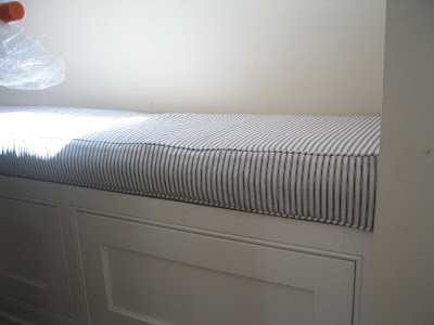
And last, but not least, I made a cushion for the breakfast nook bench in the kitchen.
Wednesday, October 28, 2009
THE KIDS' ROOMS - DEL MAR HOUSE
Of all the window treatments I did in this house, I think this room was my favorite. I liked the colors best in here. The fabric is actually Sunbrella.
They had the wall custom-painted using the blue and green of the fabric.
I did white roman shades for these windows. Originally, I was going to try and make shades that matched the stripes on the wall, but it proved impossible and would really have only matched when they were down. White seemed like a better bet. Easier, too!
And, of course, there had to be matching pillows for the bed.
Even the shower curtain matches the draperies.
This is the little boy's room. I think he was about 3 at the time and was into the beach. His mom had surf boards painted on his walls.
The window treatments were made with denim and I used rope at the top. I actually got the rope at West Marine, because it was strong enough to hold the weight of the fabric. I made a lot of buttonholes on these panels.
The large window.
Monday, October 26, 2009
LUXE - PHOTO SHOOT
If you've ever had your home shot for a magazine, you know first-hand how the reality of the room or rooms and what shows up in the magazine differ. This house is in Del Mar and I worked on it for over a year. The two rooms I am showing you here are the guest room, which made the magazine, and the master bedroom, which did not. Since I wasn't at the shoot, I do not know what rooms they actually photographed.
This is the guest room and the shot that was in the magazine.
This is how the bed actually looked. I guess they felt the red pillows were too much and replaced them with much more neutral colored ones. At least for the shoot.
View from the bed.
At one point, my client decided that the puddle was too much trouble and asked that I shorten the draperies. (I took this at the installation before I altered them.)
The draperies, the bed drape/canopy and the bathroom were all the same fabric. It was kind of a textured sheer, not horrible to sew on but definitely not my favorite kind of fabric to work with.
All the pictures below are from the master bedroom.
Flanged pillow
Lots of pillows on the bed.
The sleeping pillows hiding behind the shams.
This is in the master dressing area.
In the master bathroom. I also made a cushion for under this window, but that came later and I may not have taken a picture. Or it is someplace else, since it was done at a later date.
Next post - the kids' bedrooms.
Friday, October 23, 2009
LILY, HIBISCUS OR PLUMERIA?
This is my current business card. Although I love the polka dots and the color, I have never liked this card. It has to do more with the card stock than anything else, but whatever the reason, I want to change it. Again. Of course, it doesn't help that I had to write on it.
I am contemplating using, as a logo, a flower. I love plumeria and I love pink, but is this the flower for me?
I like the rain drops (okay, water from the hose) on this blossom and it's a lighter pink.
The calla lily is so elegant and simple.
The stargazer lily is pretty spectacular.
I do love hibiscus, too. And there are many colors to choose from.
Back to pink. Both these hibiscus shots have been posterized in photoshop. Or is unaltered better?
I looked up the meanings of all these flowers I am considering:
calla lily - regal or beauty
stargazer lily - ambition
plumeria - perfection
hibiscus - old royalty and a bringer of great power and respect
All have wonderful meanings. Another thing to keep in mind is once the image is shrunk to fit on a business card, it loses some of the impact. Is it better to keep it simple and elegant or more colorful? I really like both. How can I decide? What do you think?
Wednesday, October 21, 2009
AND YOU THOUGHT I LIKE COLOR
The other day, Rita sent me a picture of a very colorful piece of furniture. I thought, wow, that's even bright for me. Then, while blog surfing, I came across a blog called Pretty Far West. She had a post about this shop in London called Squint. All the pictures below are from their catalog/shop.
Love Seat
Lamp shades
Sofa
Wing chair
Chandelier
Monday, October 19, 2009
CHAIR CUSHIONS, MORE PHOTOS WITH ED AND FOG
I delivered these chair and ottoman cushions on Saturday. It was quite a change from the old fabric, which was a silk plaid in very muted grays and browns.
Instead of self-welt or the flat flange welt, which is what the old covers had, my client chose to go with a small braid trim.
These are in the same house, but different room. I did these a while ago, but since my client picked them up at my house, I had not seen them on the chair.
I used a contrasting silk for the flat flange.
Onto Ed and more old pictures. This was taken (I'm pretty sure) in Madrid in 1988. It was a test and I do not remember who the photographer was.
These next two shots are from a Greek sweater catalog and pretty dorky. This was probably also done in 1988. And I forget the other guy's name in the shot. Since these were photographs of the actual tears, there is nothing written on the back.
The Greeks were totally into head wraps at the time. Every single shot of me on this job had something on my head.
The other model in this photo is Jim Wilkinson.
And last but not least, we have had some serious fog the last several days. Saturday morning when I left my house at 4:50a to walk, Coronado was completely fogged in. Later it cleared up, briefly, and then rolled back in mid-afternoon. I took this photo in Del Mar as I was driving to my cousins' house Saturday around 5:45p. When I drove home around midnight, the fog was thick and driving over the bridge was very disconcerting because I couldn't see anything. Luckily, at that time of the night, there weren't many cars on the road. Kind of scary, though.
Subscribe to:
Posts (Atom)